
Luma
A beauty-gummies system built from color, texture, appetite, and everyday ritual.

Overview
Luma’s strongest cues are simple: a coral label, a clear jar, a white cap, and ruby-red gummies. Apex rebuilt the campaign around those signals, moving between vivid studio compositions, tactile macro detail, a joyful usage moment, and a compact everyday ritual.
Independent concept study. Luma is a fictional brand created by Apex Studio; no client affiliation, efficacy claim, or performance result is implied.
The system
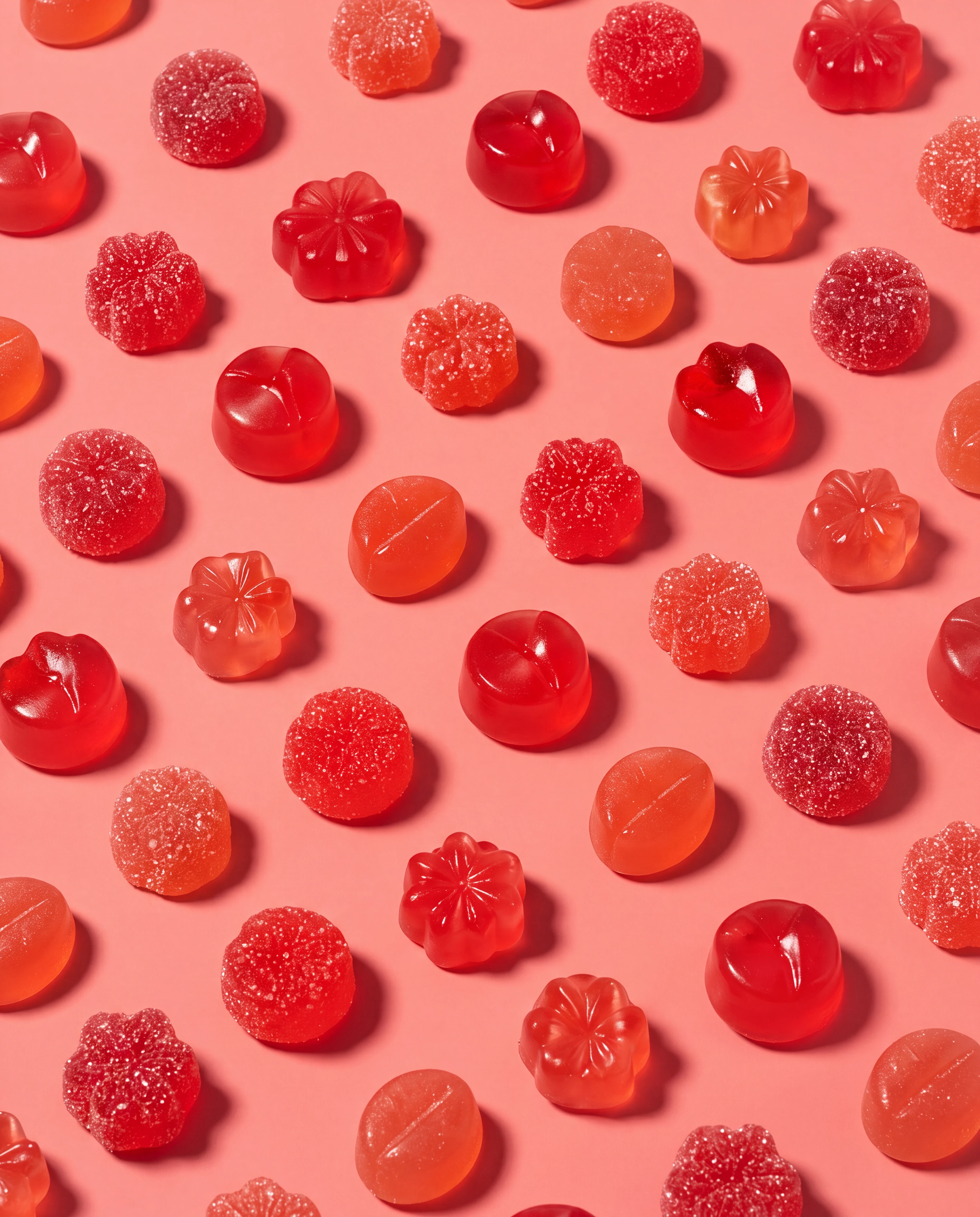
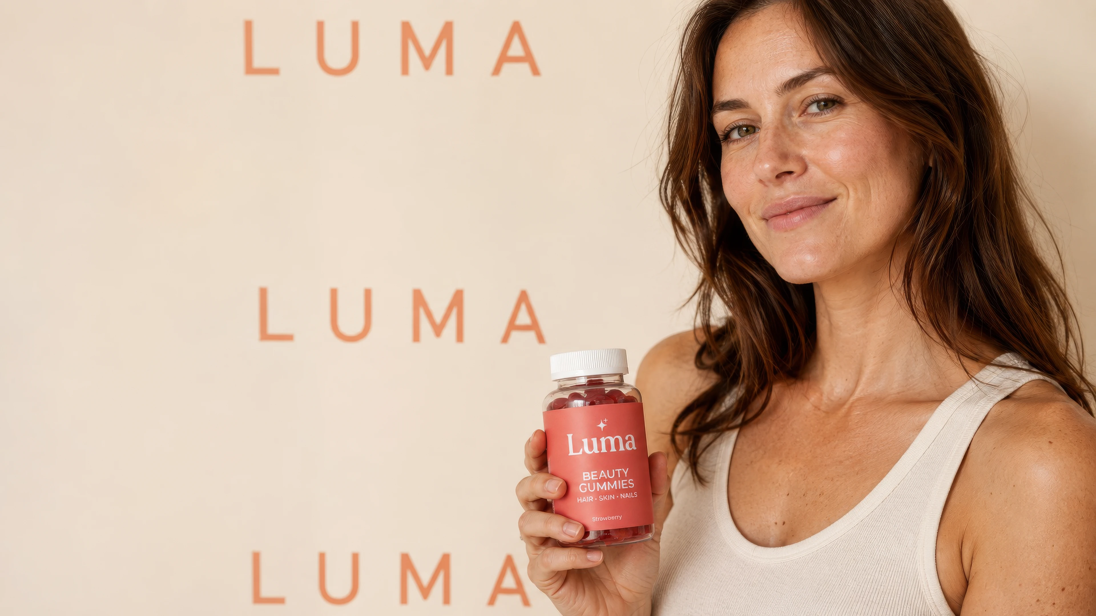
A product you can almost taste
Repetition creates instant appetite appeal, while one human frame turns the same ruby shape into a clear usage moment. The palette stays saturated and youthful without requiring a claim or headline to explain the category.
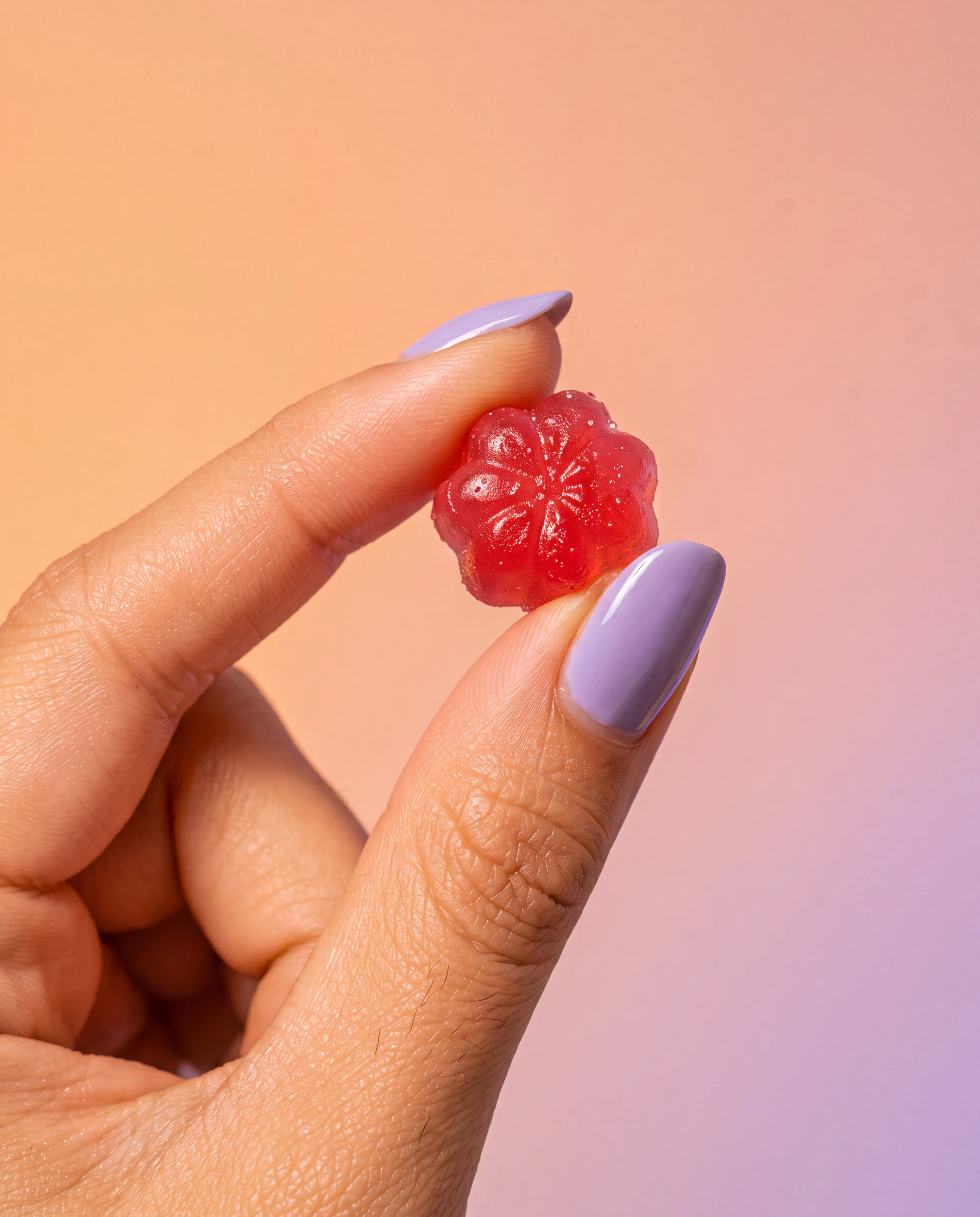

One gummy.
A whole color world.

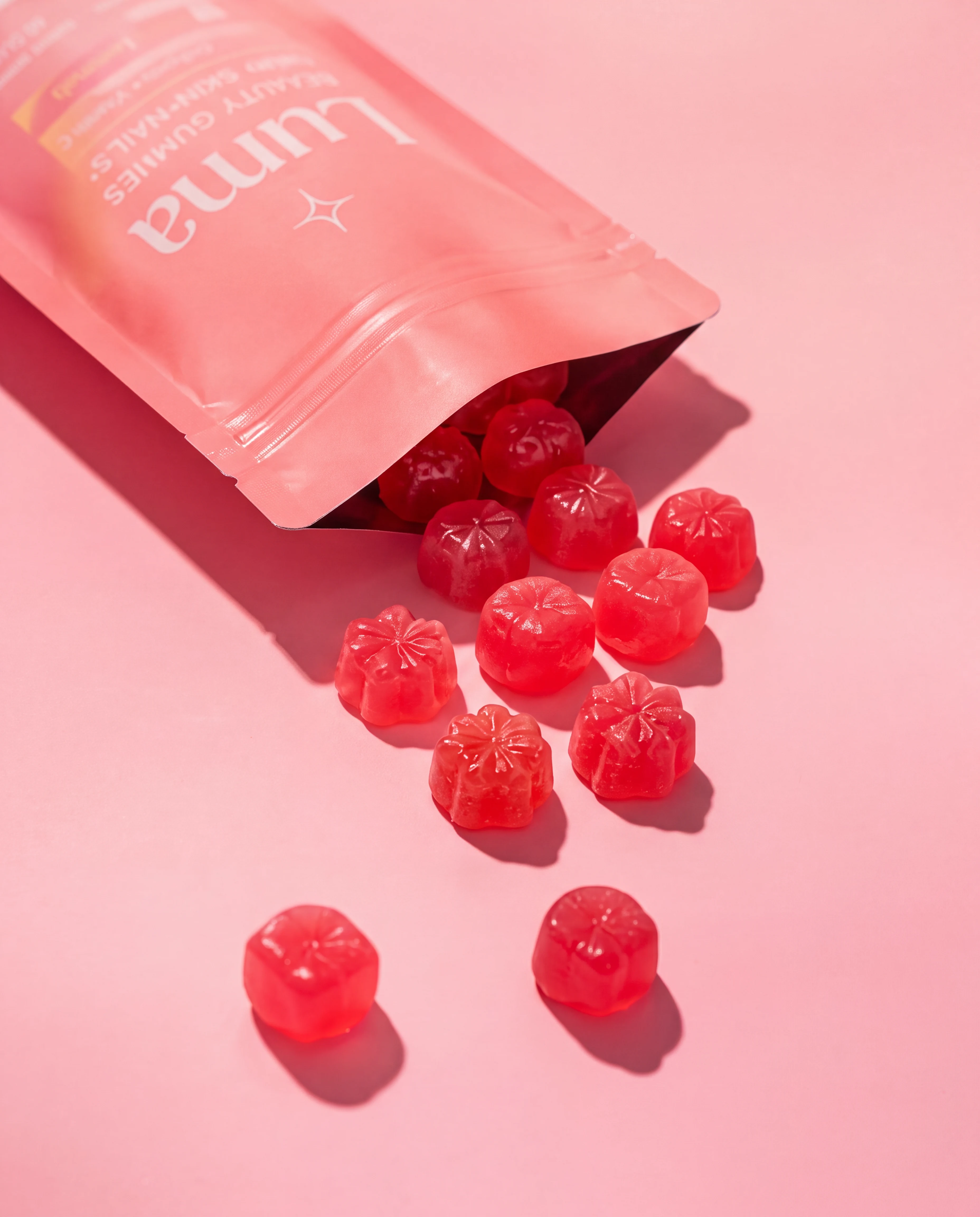
Recognition across scale
A single gummy can carry the campaign as a macro beauty object. Pull back and the pouch, jar silhouette, white cap, and coral label reconnect that tactile detail to a complete retail-ready identity.
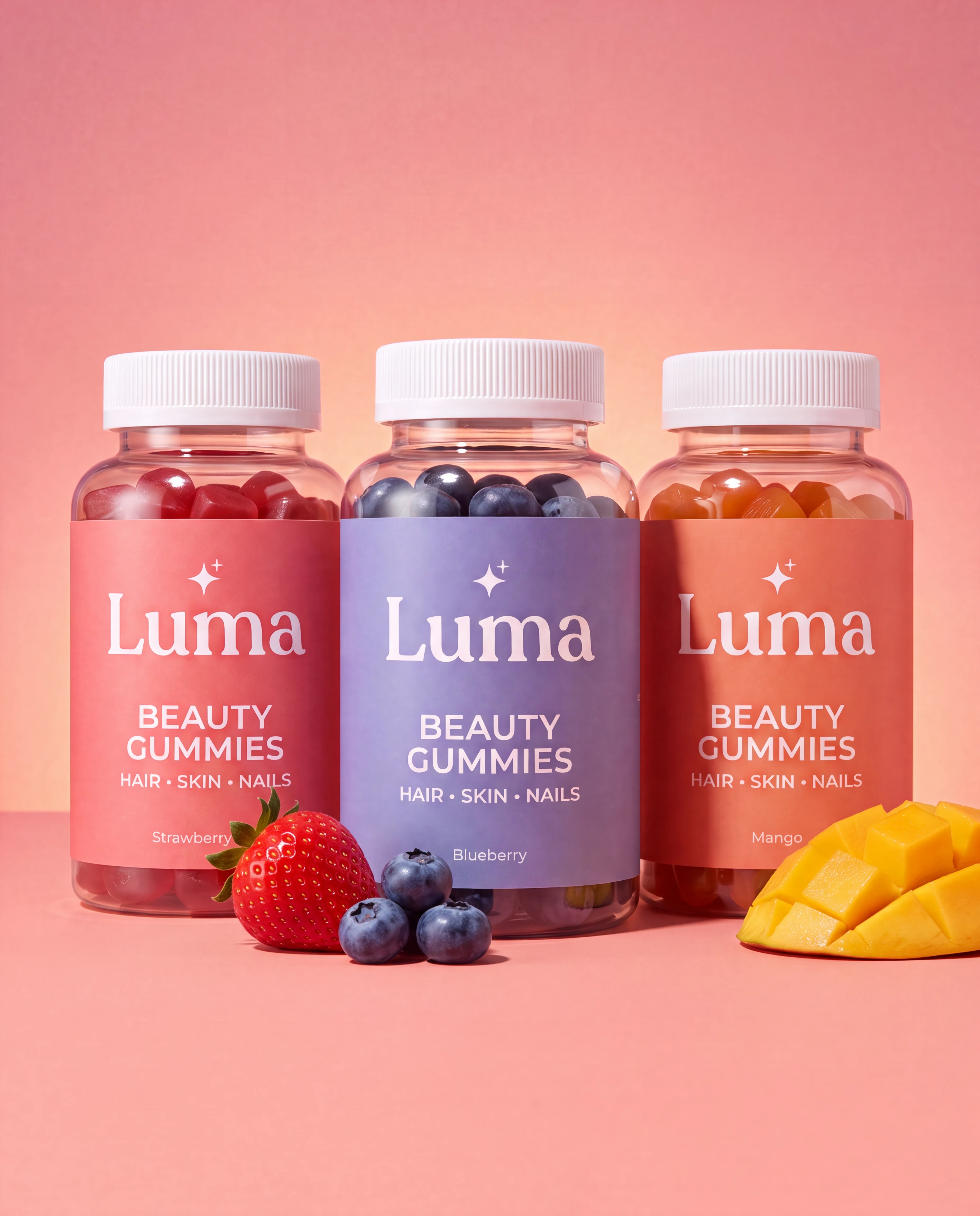
A family, not a one-off
The three-flavor lineup proves that the system can expand without losing recognition. Label color and fruit cues change, while jar geometry, cap treatment, wordmark scale, and studio lighting remain consistent.
More case studies
Browse the full work index Explore product campaign creativeYour product, next
See what your campaign system could become.
Book a short call about your next video or creative campaign.
Let’s talk